Crossposted from /r/android for /u/geegeedee
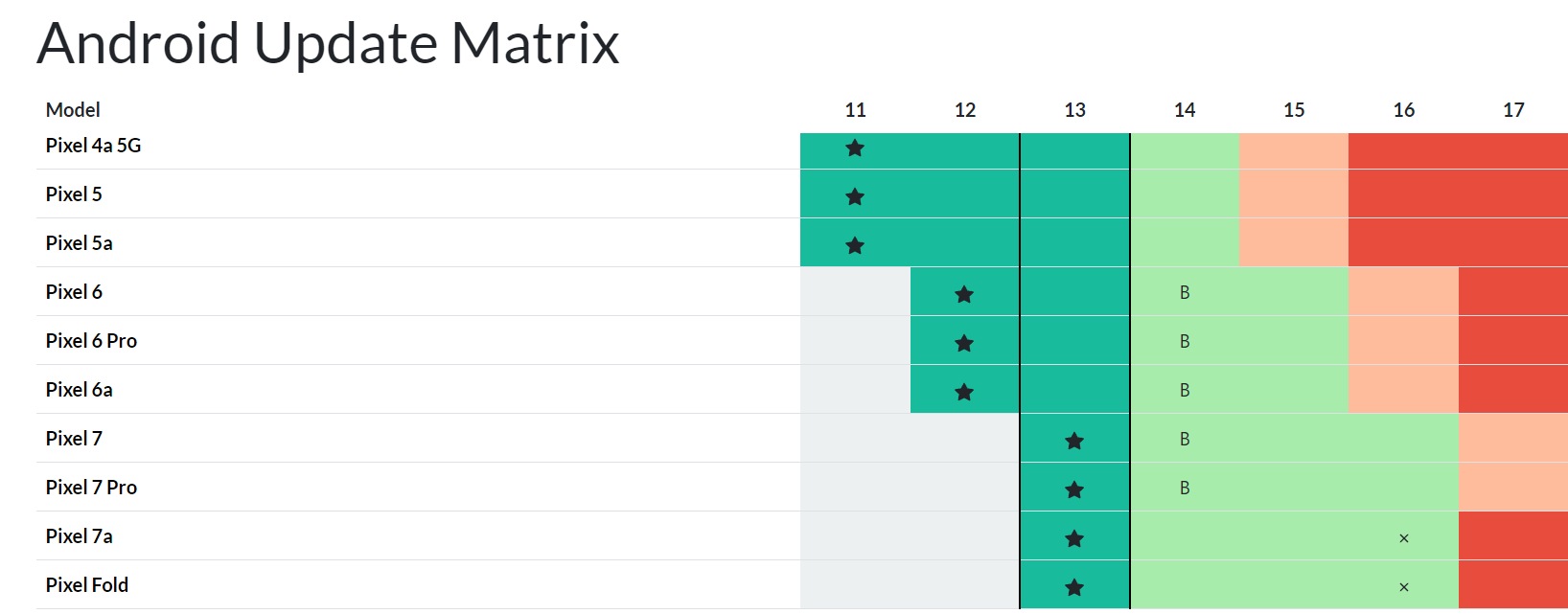
We have tried to keep track of Android updates for tons and tons of phone models for the past two years or so. Task is quite massive, but with biggest manufacturers, we have already a pretty valid data in place - and hope to get it even better.
For smaller manufacturers (Tecno, ZTE, etc), confirmed data is almost impossible to gather, so apologies for that (and if you can help us out with trustworthy sources for those manufacturers, let me know).
So… we thought, how would all that data look like if we’d build a timeline out of it. This is how it turned out:
Have you thought about adding a legend?
Agreed. The legend really should be at the top or floating or something. Not at the very bottom of the page.
Now that I’ve found the legend, it is meaningless, because I’m moderately colourblind and the picked the worst fucking colour palette.
These guys need their data viz license revoked.
I don’t think Nokia 3210 runs on Android
It’s there. You just have to scroll to the very bottom of the page to see it
It’s at the bottom. Only thing not explained is B
It’s right at the bottom
What does it mean though?
The color coded legend should be at the top of the page.
Ironically unreadable without desktop mode on mobile.
Interesting. It’s not my chart or site but it works from my S23U running Kiwi Browser.


